A quite often used control in iOS apps is the segmented control, and implementing one in SwiftUI is a breeze. What makes it interesting is the fact that a segmented control is actually a picker! So, if you know how to create a picker, then you already know how to create a segmented control.
To showcase how to implement a segmented control, consider the following piece of code. It adds an Image to a SwiftUI view:
|
1 2 3 4 5 6 7 8 9 10 11 12 13 |
var body: some View { VStack { Image(“birds”) .resizable() .aspectRatio(contentMode: .fit) .frame(maxWidth: 300) .clipShape(Rectangle()) Spacer().frame(height: 50) } } |
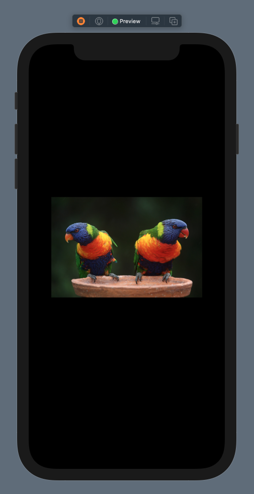
In the last line of the above code there is a call to the clipShape modifier in order to apply a custom shape mask to the image.
Note: You can find more about the clipShape modifier in this post.
Suppose that we want to make that mask dynamic, and instead of the Rectangle shape to use the following custom one:
|
1 2 3 4 5 6 7 8 9 10 11 12 13 14 15 16 17 18 19 20 21 22 |
struct ShapeOnDemand: Shape { @Binding var shapeIndex: Int func path(in rect: CGRect) -> Path { switch shapeIndex { case 1: return RoundedRectangle(cornerRadius: 25.0).path(in: rect) case 2: return Circle().path(in: rect) case 3: return Capsule().path(in: rect) default: return Rectangle().path(in: rect) } } } |
The ShapeOnDemand type conforms to the Shape protocol, which requires to implement the path(in:) method. In it, the path of a different shape is being returned depending on the value of the shapeIndex property.
Let’s make it possible to change shape on the fly now using a segmented control. Back in the view’s body we need to initialize a Picker, but before doing so it’s necessary to declare a property marked with the @State property wrapper that will be indicating the preferred shape in the view:
|
1 2 3 4 5 6 7 |
struct ContentView: View { @State private var selectedShape: Int = 0 … } |
We can now create a Picker instance which will become the segmented control:
|
1 2 3 4 5 |
Picker(“Change Shape”, selection: $selectedShape) { } |
The above is not enough though; what will actually change it into a segmented control is to apply the pickerStyle view modifier, specifying the SegmentedPickerStyle as the desired one:
|
1 2 3 4 5 6 |
Picker(“Change Shape”, selection: $selectedShape) { } .pickerStyle(SegmentedPickerStyle()) |
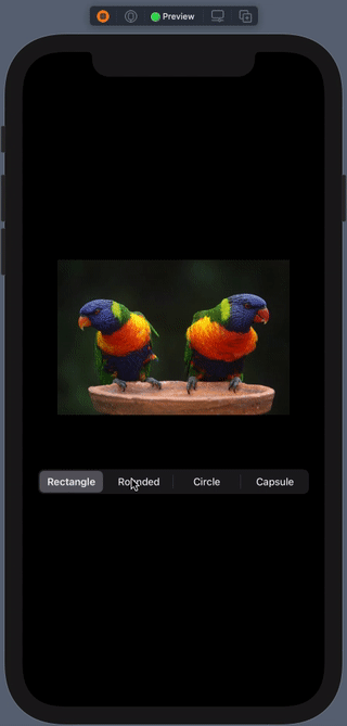
We can now provide the values of the control’s segments:
|
1 2 3 4 5 6 7 8 9 |
Picker(“Change Shape”, selection: $selectedShape) { Text(“Rectangle”) Text(“Rounded”) Text(“Circle”) Text(“Capsule”) } .pickerStyle(SegmentedPickerStyle()) |
Even though the above will show perfectly the control’s segments, it will have no effect when switching from one to another. There must be done some sort of a matching between the shape described by each text, and the value that the selectedShape property should get.
Thankfully, that’s really easy to do using the .tag modifier:
|
1 2 3 4 5 6 7 8 9 |
Picker(“Change Shape”, selection: $selectedShape) { Text(“Rectangle”).tag(0) Text(“Rounded”).tag(1) Text(“Circle”).tag(2) Text(“Capsule”).tag(3) } .pickerStyle(SegmentedPickerStyle()) |
Appending the tag on each Text above will result in setting the value 0 on selectedShape when the first segment is selected, value 1 when the Rounded segment is selected, and so on.
In order for all that to work, there is one last change necessary to be done in the original demo code that sets the shape mask. We have to replace this:
|
1 2 3 |
.clipShape(Rectangle()) |
with this:
|
1 2 3 |
.clipShape(ShapeOnDemand(shapeIndex: $selectedShape)) |
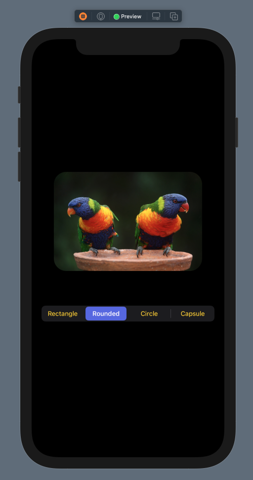
See that the binding value of the selectedShape property is provided to the ShapeOnDemand initializer. That means that every time its value gets changed, the proper shape will be returned from the ShapeOnDemand instance.
After applying some padding, here is the segmented control working:
Using an array of values
In the above example we specified four different Text views that match to each segment of the segmented control. However, by containing all displayable values into an array we can avoid doing that and manage to have just one Text.
To see that in action, let’s declare the following collection first with all the desired shapes in the necessary order:
|
1 2 3 4 5 6 7 |
struct ContentView: View { let shapes = [“Rectangle”, “Rounded”, “Circle”, “Capsule”] … } |
In the Picker’s content now, we will use a ForEach in order to iterate through all values of the shapes collection and create a Text for each one:
|
1 2 3 4 5 6 7 8 9 |
Picker(“Change Shape”, selection: $selectedShape) { ForEach(shapes, id: \.self) { Text($0) } } .pickerStyle(SegmentedPickerStyle()) .padding(20) |
The highlighted lines in the above snippet is the replacement for the four Texts we had used earlier.
But wait a second; what about the matching between the segments and the selectedShape value?
That’s a missing piece, and once again we will use the tag modifier as above. This time, however, we won’t hardcode any specific value. Instead, we will get the index of each text in the shapes array on the fly. See the highlighted line right next:
|
1 2 3 4 5 6 |
ForEach(shapes, id: \.self) { Text($0) .tag(shapes.firstIndex(of: $0)!) } |
The segmented control will work as expected once again after doing that last but crucial addition.
Overriding default colors
Unfortunately, there is no SwiftUI-native way to change the default colors of the segmented control. The solution that will let us override the default colors is to change the appearance of the UISegmentedControl, like we would have done in a UIKit based application.
In order to achieve that, it’s necessary to explicitly define the init() method of the view we are working on:
|
1 2 3 4 5 6 7 8 9 10 |
struct ContentView: View { init() { } … } |
Inside the init() body, we will specify the tint color of the selected segment, the text color in normal state, and the text color in selected state. Here is how all that is done:
|
1 2 3 4 5 6 7 |
init() { UISegmentedControl.appearance().selectedSegmentTintColor = .systemIndigo UISegmentedControl.appearance().setTitleTextAttributes([.foregroundColor: UIColor.systemYellow], for: .normal) UISegmentedControl.appearance().setTitleTextAttributes([.foregroundColor: UIColor.white], for: .selected) } |
The results of the above code are shown right below:
Summary
Implementing a segmented control and changing the view contents depending on the selection is an easy task. I showed you two different ways to populate data in segments; and along with that how to match the selected segment with a @State property. And as a final touch, how to apply custom colors and change the default appearance.
Thank you for taking the time to read this post! See you soon.