Border for the view is something that can create a beautiful layout.
In SwiftUI, there is a view modifier called a border.
Let’s say you have some Text view you want to add a border.
Text(“Smash Swift!”)
There easiest way is just to add a border with Color.
Text(“Smash Swift!”)
.border(Color.black)
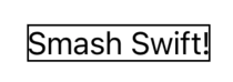
By default, the border width is 1, you can change it by adding the width parameter.
Text(“Smash Swift!”)
.border(Color.red, width: 3)
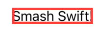
Now, the color is red to help you notice when the width is more than 1 then it can overlap content. To prevent it, add padding with the same value.
Text(“Smash Swift!”)
.padding(3)
.border(Color.red, width: 3)
You can also add more than just one border, they will overlap each other, and order matters!
Text(“Smash Swift!”)
.padding(3)
.border(Color.red, width: 3)
.border(Color.black)

To change the style you can use the overlay view modifier, it also can be used many times on the same view.
Text(“Smash Swift!”)
.overlay (
Rectangle()
.stroke(Color.red, style: StrokeStyle(lineWidth: 1, lineCap: .round, lineJoin: .round))
)
It gives the same result as .border(Color.red), however, now you can change the border to be dashed.
Text(“Smash Swift!”)
.overlay (
Rectangle()
.stroke(Color.blue, style: StrokeStyle(lineWidth: 1, dash: [4]))
)

StrokeStyle has few other possible parameters.
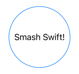
You can also set a circle as a background, but to do it you need to set the frame first because the overlay doesn’t go beyond the frame.
Text(“Smash Swift!”)
.frame(width: 120, height: 120)
.overlay (
Circle()
.stroke(Color.blue, style: StrokeStyle(lineWidth: 1))
)
The last option is to use ZStack.
ZStack {
Circle()
.stroke(Color.blue, style: StrokeStyle(lineWidth: 1))
Text(“Smash Swift!”)
}
.frame(width: 120, height: 120)
The result is the same as previously.
