In the toolbox of SwiftUI, overlay and background are two extremely useful view modifiers that play an indispensable role in various development scenarios. This article will delve into the unique attributes of these two modifiers, clarify their fundamental differences from ZStack, and identify the scenarios they are best suited for.
Given that
overlayandbackgroundoften share similar traits in many cases, to simplify the discussion, this article will primarily useoverlayto represent both, unless a distinction is necessary in specific contexts.
Overlay: A Special Case of ZStack?
In some cases, developers stacking two views may find that whether using ZStack or overlay, the final visual outcome appears the same. Consider the following example:
struct SameView: View {
  var body: some View {
    VStack {
      // ZStack
      ZStack {
        blueRectangle
        yellowRectangle
      }
      // overlay
      blueRectangle
        .overlay(yellowRectangle)
    }
  }

  var blueRectangle: some View {
    Rectangle()
      .foregroundStyle(.blue.gradient)
      .frame(width: 200, height: 200)
  }

  var yellowRectangle: some View {
    Rectangle()
      .foregroundStyle(.yellow.gradient)
      .frame(width: 120, height: 120)
  }
}
So, can we consider overlay as a specific case of ZStack, namely one that only supports stacking two layers?
The answer is no. Despite their similarities in certain scenarios and differences in the ability to modify the stack order and the number of supported views, overlay and ZStack differ fundamentally in their implementation principles and primary purposes, mainly reflected in the following aspects:
- Relationships between views
- Logic of alignment
- Role of overall dimensions in layout
For the first point, it is relatively easy for developers to understand that in ZStack, all views are on the same level, determined by their zIndex and the order of declaration. In the context of using overlay, there is a parent-child relationship between the views, with the view modified by overlay acting as the parent. This difference in relationship leads to significant functional and semantic differences between the two.
Who Aligns with Whom
When exploring how ZStack and overlay manage view alignment, we can understand the differences between them through the following example:
// ZStack
ZStack(alignment: .topTrailing) {
  blueRectangle
  yellowRectangle
}

// overlay
blueRectangle
  .overlay(alignment: .topTrailing) {
    yellowRectangle
  }
In ZStack, blueRectangle and yellowRectangle are in a sibling relationship. Here, SwiftUI aligns all views within the ZStack at the topTrailing position, stacking them according to the order of declaration.
In overlay, blueRectangle acts as the parent view, and yellowRectangle as the child. SwiftUI first positions blueRectangle, then aligns the topTrailing of yellowRectangle with the topTrailing of blueRectangle.
This might sound a bit confusing, but if we attempt to create a specific visual effect, the differences become very clear. For example, consider constructing a 200 x 200 rectangle and placing a circle with a radius of 30 at both its topTrailing and bottomLeading corners, aligning the circle’s center with the rectangle’s corners.

Using overlay to describe this scenario becomes very clear and straightforward:
struct Demo1View: View {
  var body: some View {
    blueRectangle
      .overlay(alignment: .topTrailing) {
        yellowCircle
          .alignmentGuide(.top) { $0[.top] + $0.width / 2 }
          .alignmentGuide(.trailing) { $0[.trailing] - $0.height / 2 }
      }
      .overlay(alignment: .bottomLeading) {
        yellowCircle
          .offset(x: -30, y: 30) // When the exact dimensions of the views are known
      }
  }

  var blueRectangle: some View {
    Rectangle()
      .foregroundStyle(.blue.gradient)
      .frame(width: 200, height: 200)
  }

  var yellowCircle: some View {
    Circle()
      .foregroundStyle(.yellow.gradient)
      .frame(width: 60, height: 60)
  }
}
In a solution using only one ZStack, if the dimensions of the views are unknown, positioning them using alignmentGuide or offset can become extremely complex. Readers can try implementing this requirement with a single ZStack to appreciate the challenge.
Therefore, given the fundamental differences in alignment logic between overlay and ZStack, when it’s necessary to base other views around a primary one, overlay and background are clearly superior choices. They not only make the declaration of child views clearer but also make the layout more intuitive.
For an in-depth understanding of the layout mechanism in SwiftUI, refer to Alignment in SwiftUI: Everything You Need to Know.
Who Controls the Size
In SwiftUI, understanding various size concepts is crucial. Required Size refers to the size a view is expected to occupy within the layout system, typically the size it achieves when there is sufficient space. The required size of one view can impact the available space and layout position of other views.
Although a single ZStack or an overlay composite view may appear visually similar in the final outcome, their required sizes can be vastly different.
Consider a simple requirement: placing a circle at the topTrailing corner of a rectangle.

When we implement this with a ZStack and alignmentGuide, the required size becomes 230 x 230, which is the size of the rectangle plus the radius of the circle.
ZStack(alignment: .topTrailing) {
  blueRectangle
  yellowCircle
    .alignmentGuide(.top){ $0[.top] + $0.height / 2}
    .alignmentGuide(.trailing){ $0[.trailing] - $0.width / 2}
}
.border(.red, width: 2)
This is because ZStack takes the combined size of all its internal views as its required size. The approach with overlay is entirely different:
blueRectangle
  .overlay(alignment: .topTrailing) {
    yellowCircle
      .alignmentGuide(.top) { $0[.top] + $0.height / 2 }
      .alignmentGuide(.trailing) { $0[.trailing] - $0.width / 2 }
  }
  .border(.red, width: 2)
With overlay, regardless of the size of the views embedded within, the layout system considers only the main view’s required size as the size of the entire composite view.
This characteristic may be inconsequential when the composite view exists independently, but when laid out with other views, the different mechanisms for calculating required size can significantly affect the overall layout.
For example:
// overlay
HStack(alignment: .bottom, spacing: 0) {
      blueRectangle
        .overlay(alignment: .topTrailing) {
          yellowCircle
            .alignmentGuide(.top) { $0[.top] + $0.height / 2 }
            .alignmentGuide(.trailing) { $0[.trailing] - $0.width / 2 }
        }
        .border(.red, width: 2)
      Rectangle()
        .foregroundStyle(.red.gradient)
        .frame(width: 200, height: 200)
    }
// ZStack
HStack(alignment:.bottom,spacing: 0) {
      ZStack(alignment: .topTrailing) {
        blueRectangle
        yellowCircle
          .alignmentGuide(.top){ $0[.top] + $0.height / 2}
          .alignmentGuide(.trailing){ $0[.trailing] - $0.width / 2}
      }
      .border(.red, width: 2)
      Rectangle()
        .foregroundStyle(.red.gradient)
        .frame(width: 200, height: 200)
    }
If we wish to place circles at different positions (topTrailing and bottomLeading) and include the space they occupy in the required size, then using multiple ZStacks might be a better choice, especially when the exact dimensions of the views are unknown:
ZStack(alignment: .bottomLeading) {
  ZStack(alignment: .topTrailing) {
    blueRectangle
    yellowCircle
      .alignmentGuide(.top) { $0[.top] + $0.height / 2 }
      .alignmentGuide(.trailing) { $0[.trailing] - $0.width / 2 }
  }
  yellowCircle
    .alignmentGuide(.bottom) { $0[.bottom] - $0.height / 2 }
    .alignmentGuide(.leading) { $0[.leading] + $0.width / 2 }
}
.border(.red, width: 2)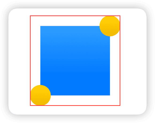
Although this approach is more complex than using overlay, it is undoubtedly effective in accurately reflecting required sizes.
To learn more about the dimensions in SwiftUI and why using
offsetin aZStackdoes not change the required size, read SwiftUI Layout: The Mystery of Size and SwiftUI Layout: Cracking the Size Code.
Overlay is the Perfect Partner for GeometryReader
Due to the parent-child relationship that overlay and background maintain with the main view in the layout, they are often the preferred tools for accessing geometric information of the main view:
blueRectangle
  .background(
    GeometryReader{ proxy in
      Color.clear // Creates a transparent view that matches the size of the main view
        .task(id:proxy.size){
          size = proxy.size
        }
    }
  )
Using the feature of overlay and background not to change the required size of the composite view, we can draw content that exceeds the size of the main view within them, and obtain these contents’ size information without affecting the overall layout. This ensures that when the dimensions of a view exceed those of the main view, its impact on the overall layout is effectively isolated.
Here is a practical example where I used this technique to dynamically adjust the height of a sheet in SwiftUI based on the height of the view. By using background to pre-fetch the height of the sheet view that will be displayed, and then adjusting the presentationDetents accordingly:
struct AdaptiveSheetModifier<SheetContent: View>: ViewModifier {
  @Binding var isPresented: Bool
  @State private var subHeight: CGFloat = 0
  var sheetContent: SheetContent

  init(isPresented: Binding<Bool>, @ViewBuilder _ content: () -> SheetContent) {
    _isPresented = isPresented
    sheetContent = content()
  }

  func body(content: Content) -> some View {
    content
      .background(
        sheetContent // Pre-draws the sheet content in the background, which does not affect the required size of the content
          .background( // Obtains the pre-drawn view's size in another background layer
            GeometryReader { proxy in
              Color.clear
                .task(id: proxy.size.height) {
                  subHeight = proxy.size.height
                }
            }
          )
          .hidden() // Hides this pre-drawn view
      )
      .sheet(isPresented: $isPresented) {
        sheetContent
          .presentationDetents([.height(subHeight)])
      }
      .id(subHeight)
  }
}
The complete code can be viewed here. The effect of using this method is as follows:
This code demonstrates how to effectively utilize the features of overlay and background to optimize dynamic layout needs in SwiftUI applications.
Please read GeometryReader: Blessing or Curse? to learn more about using
GeometryReadereffectively.
The Primacy of the Main View
In SwiftUI, using multiple view modifiers on a single view creates a complex hierarchy of types. Consider the following code, where we have a rectangle with two overlapping circles of different colors:
Rectangle().foregroundStyle(.blue)
  .frame(width: 200, height: 200)
  .overlay(
    Circle().foregroundStyle(.yellow)
      .frame(width: 60, height: 60)
  )
  .overlay(
    Circle().foregroundStyle(.red)
      .frame(width: 40, height: 40)
  )
The type generated by this code is as follows:
ModifiedContent<
  ModifiedContent<
    ModifiedContent<
      ModifiedContent<
        Rectangle, _ForegroundStyleModifier<Color>
      >, _FrameLayout
    >, _OverlayModifier<
      ModifiedContent<
        ModifiedContent<
          Circle, _ForegroundStyleModifier<Color>
        >, _FrameLayout
      >
    >
  >, _OverlayModifier<
    ModifiedContent<
      ModifiedContent<
        Circle, _ForegroundStyleModifier<Color>
      >, _FrameLayout
    >
  >
>
The type indicates that the outermost overlay acts on a composite view that includes both the Rectangle and the first overlay. Despite the complexity of the underlying types, developers can completely ignore these details when writing code. No matter how many layers of overlay or background are applied, they always treat the view as the main view. Developers only need to focus on the order of declaration of background or overlay.
For example, in the following declaration:
RootView()
  .overlay(A())
  .background(D())
  .overlay(B())
  .background(C())
The final rendering order will be:
C -> D -> RootView -> A -> BBy flexibly using overlay and background, we can greatly simplify the management of complex view structures and make modifications and maintenance of views much more convenient.
Background’s SafeArea Overflow Properties
SwiftUI provides several constructors for background, one of which is particularly noteworthy for developers:
public func background<S>(_ style: S, ignoresSafeAreaEdges edges: Edge.Set = .all) -> some View where S : ShapeStyleThis constructor allows a background view that conforms to the ShapeStyle protocol to control whether it extends to the edges of the safe area using the ignoresSafeAreaEdges parameter. This feature is especially useful when dealing with fullscreen views or layouts that require special handling of safe areas.
For example, in the article Mastering SwiftUI’s Safe Area, we demonstrated how to use this feature to allow a bottom status bar declared with safeAreaInset to completely fill the bottom safe area on full-screen devices without any additional adjustments:
Color.white
  .safeAreaInset(edge: .bottom, spacing: 0) {
    Text("Bottom Bar")
      .font(.title3)
      .foregroundColor(.indigo)
      .frame(minWidth: 0, maxWidth: .infinity, minHeight: 0, maxHeight: 40)
      .padding()
      .background(.green.opacity(0.6))
  }
Since the default value of ignoresSafeAreaEdges is all (meaning it allows filling the safe area in any direction), when developers do not want the background to extend to specific safe areas, they can explicitly specify the edges to exclude:
struct SafeAreaView: View {
  var body: some View {
    VStack {
      Text("Hello World")
    }
    .frame(maxWidth: .infinity, maxHeight: .infinity)
    .background(.indigo, ignoresSafeAreaEdges: [.top]) // Excluding the top safe area
  }
}
The flexible application of this feature can significantly enhance the adaptability and visual impact of layouts.
Conclusion
This article explored the key features of overlay and background in SwiftUI. Although different modifiers and layout containers seem to achieve similar effects in various scenarios, each tool has its unique design objectives and underlying implementations, which determine their best use cases. A deep understanding of how these tools work is crucial because it helps us choose the most suitable solutions when facing specific layout challenges.
Through this discussion, we hope readers will better understand the powerful capabilities of these layout tools and learn how to flexibly apply them in practical development to optimize interface design.